ART DIRECTION
PRODUCT LAUNCH // CREATIVE DIRECTION & PRODUCTION
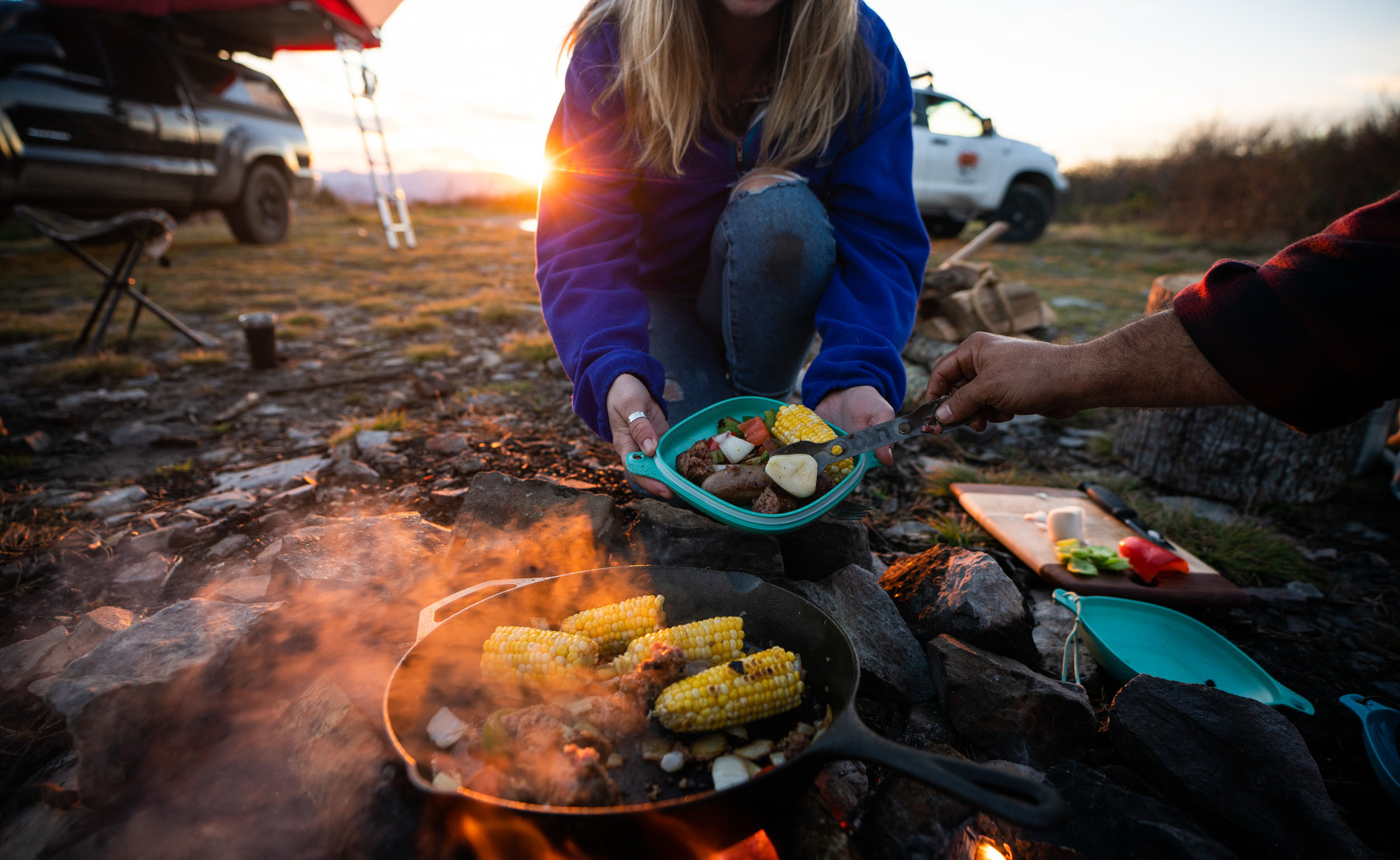
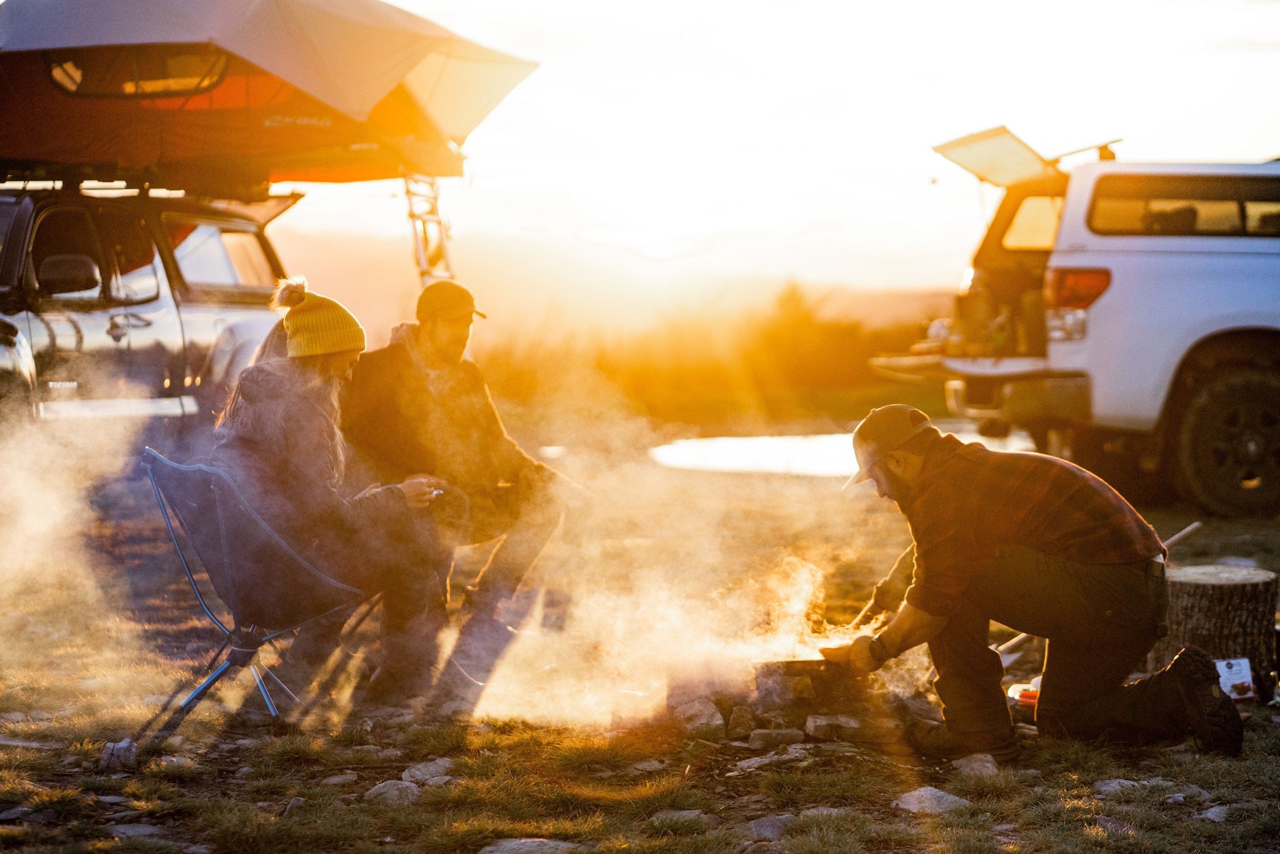
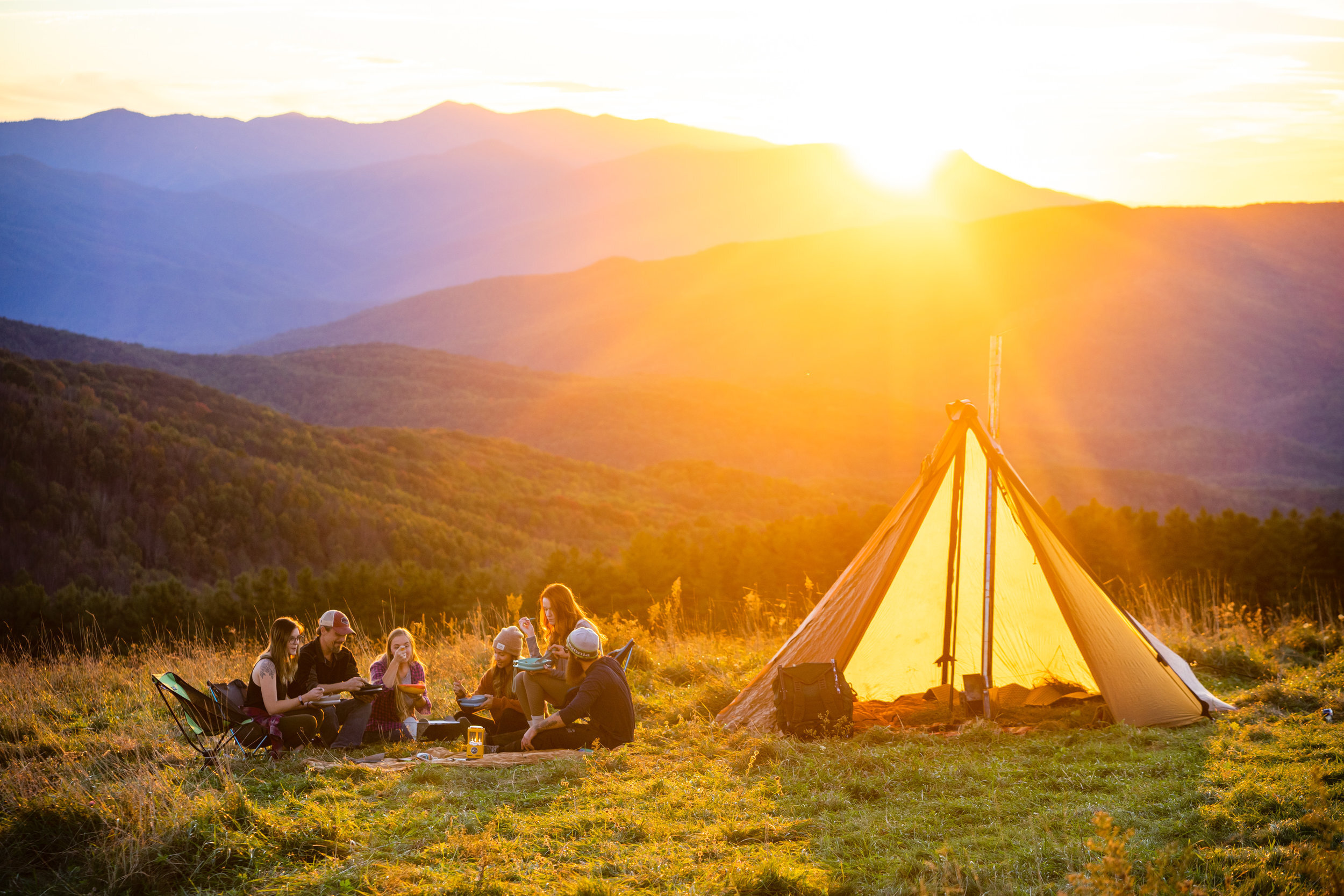
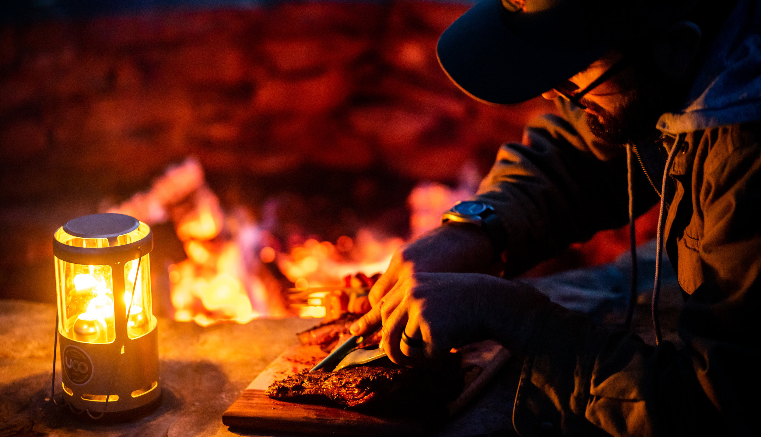
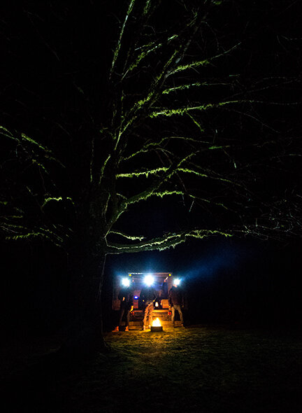
The new line of UCO Ware products needed a compelling, aspirational, and functional imagery set to help tell the product story. Showing the product in use while utilizing the natural gold glow of the setting sun or the campfire helped me attain a constant thread of UCO Gold — hues similar to the primary brand color. With the help of Steven Yoccum, an accomplished outdoor photographer, we captured many images in and around the smokey mountains of North Carolina and Tennessee throughout four days. Getting the shots took a lot of effort. We were hiking to peaks with sweeping views before sunrise and sunset for set up, meal prep and cooking, directing models and making sure the scenes were curated, and ensuring everything was in place on that excellent light. Sunrises and sunsets are unpredictable, but with good planning and direction, we managed to come out of the shoot with some fantastic stuff.
PACKAGING DESIGN
UCO WARE PACKAGING // DIRECTION. DESIGN. PRODUCTION
UCO Ware was entering a fairly saturated market and would be displayed on shelves alongside many competitors. To help the product catch customers' eyes, I designed this packaging to stand out on the shelf by using bright poppy colors and elevated production techniques. I used natural textures, contrasting brand colors, and a SPOT UV Treatment, which helped add depth and texture to the cardboard packaging. Vintage scout manuals and field guides inspire technical spec and product features displayed on the back of the packaging.
PRODUCT PHOTOGRAPHY


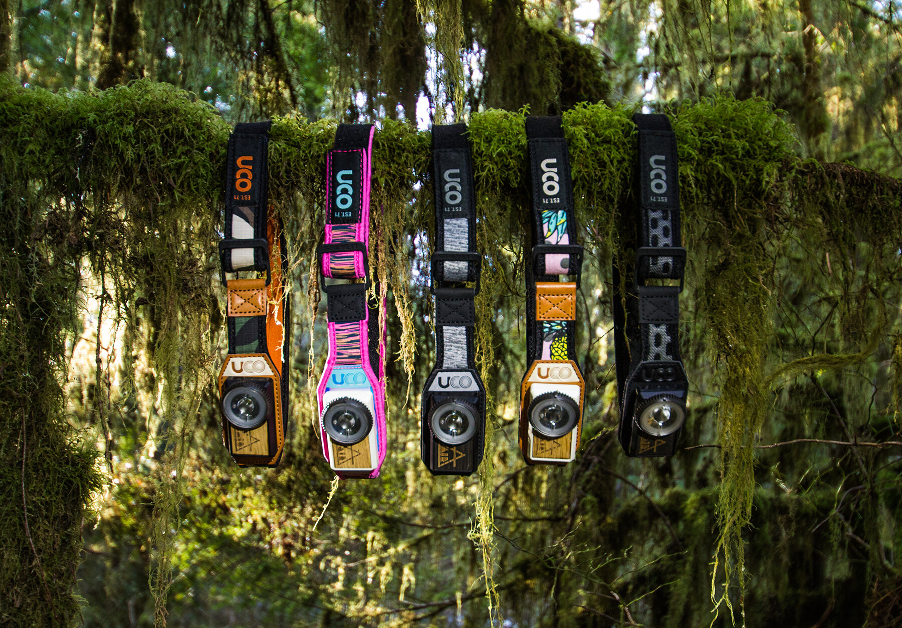


PRODUCT CATALOG
2017 UCO GEAR PRODUCT CATALOG // DIRECTION & PRODUCTION
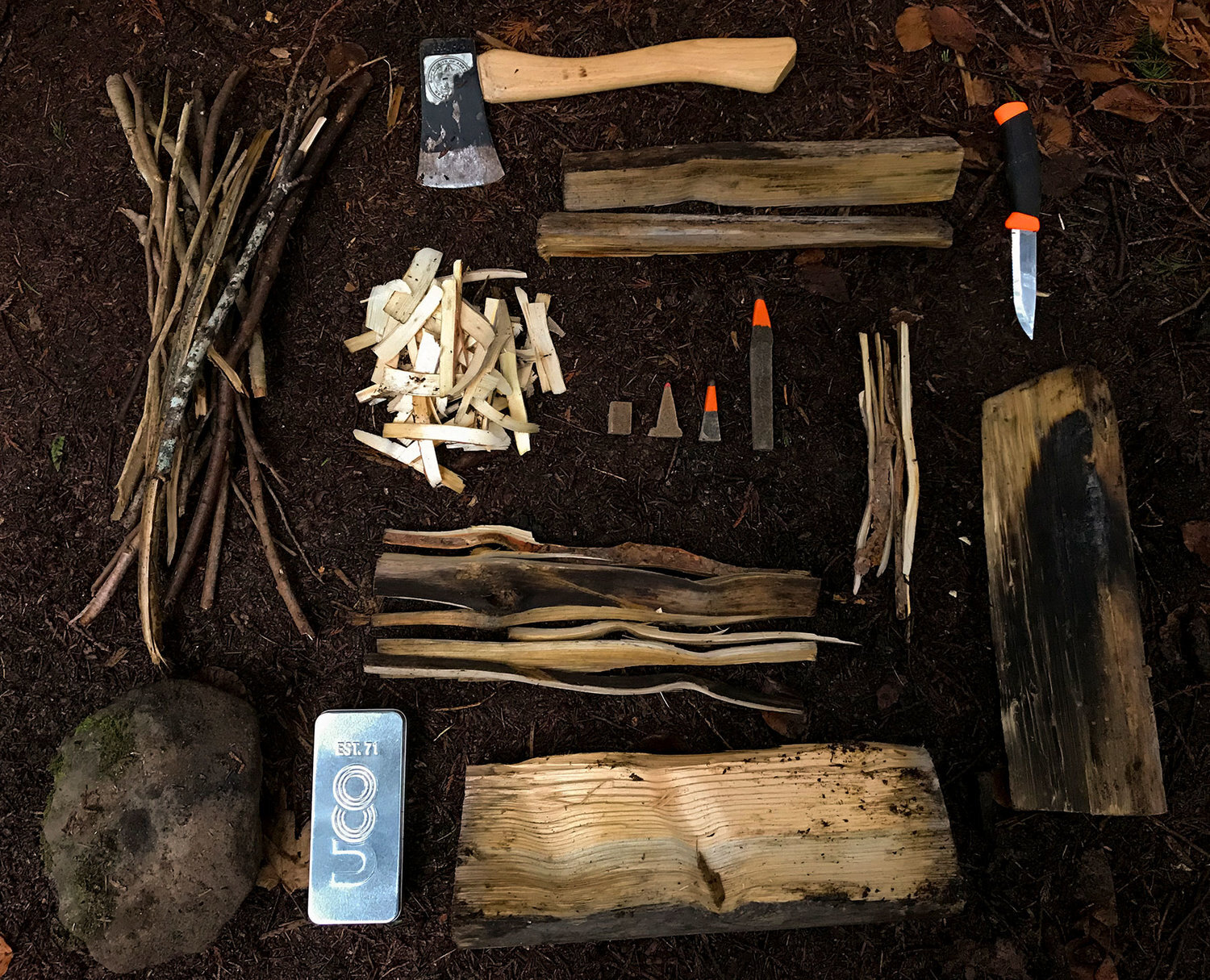
I wanted the 2017 UCO Product Catalog to convey UCO's rich heritage. Elements of the brand design system are found throughout this catalog, acting as common threads found through all creative assets in print, social, web, and packaging. I decided to use distressed, weathered textures and props as the backdrop for every product category image. Showing these products next to live vegetation and rough natural materials is intended to mimic their use at a campground, placed on an old wooden table within a campsite. Product tech and feature callouts are depicted using illustrated imagery inspired by vintage scout manuals and field guides. I created and compiled the imagery and graphics, laid them out along with technical specs and product information in Indesign, and prepared the print production files.
ECOMM BANNERS & GRAPHICS
TRADESHOW
BOOTH DESIGN
TRADESHOW // ART DIRECTION, DESIGN, PRODUCTION,
This tradeshow booth was designed to embody a rustic a-frame-style cabin. I wanted to bring elements from the outdoors into this build and used live foliage, natural materials, and rugged textures to bring this to life. Designing this took around two months, from concept to completion. I developed drawings and schematics using 3D interior design software for the initial layout plans and used Photoshop to render in the artwork and products to show how they should be placed when built in the field. I crafted the fixtures and designed and printed the signs entirely in-house using a large-format ink jet digital printer. I had wooden displays laser engraved with technical product specifications and schematics.


